Michael Douville | Interview with Charles Nenner | Cycle Analysis Main Charts Explained
Creating Wealth -@michaeldouville690 - Dr. Charles Nenner explains main charts: 1️⃣ Sunspot intensity correlation with what the Dow Jones does; 2️⃣ Long term situation in equity markets, people losing on the bonds, inflation soon to be 12-13%; 3️⃣ Right now the cycle is stopping; 4️⃣ If unemployment goes very low, the stock market turns around and sells off; 5️⃣ Crude oil prices are going higher, natural gas starting a new up move, a lot of things look very suspicious and inflationary; 6️⃣ Dow Jones is still down into March, gold and bond market look toppy; 7️⃣ Making money in the commodity market; 8️⃣ Longer term interest rates continue to go up, so you have to stay out of the bond, gold and equity markets.

Related videos
Yahoo “Breakout” | Post-Downgrade Markets | Key Technical Levels to Watch
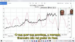
Charles Nenner on Bitcoin, Bovespa, and Brazilian Real with Antonio Ramos

Dr. Charles Nenner & Francis Hunt | Markets Forecast | Cycle Trading Strategy

Antonio Ramos | Gas and Oil | Track Record YTD 2022 UNG | USO ETFs

Charles Nenner with Antonio Ramos | Swiss Market Update

Michael Douville | Interview with Charles Nenner | How cycles work | Inflation
Still not sure?
Get better experience for your future investments.
Set up in minutes – no credit card is required.
Start a 30-DAY FREE TRIAL today!